give me your jumbled articles and photos yearning to be organized.
Case Study
Corporate Magazine
100+ pages : published quarterly
Background:
Published quarterly, each issue of this national food service company’s corporate magazine is used as a tool to educate readers about sustainable food systems, celebrate the accomplishments of their staff and clients, and promote their services to prospective accounts. Started as a single-page newsletter in 1988, the publication has since grown into a 100+ page full-color perfect-bound magazine. But by 2016, when I was brought into the project, the style of the magazine hadn’t kept up with the evolutions taking place within the company. They wanted it to better reflect their modern approach to food and food service. Once the redesign was completed, I stayed on the project and am currently responsible for building each issue from scratch, using a clean template of the new look. I love working on it every three months… it’s like a huge, digital puzzle!
Redesign:
With instructions to use “thick and thin lines with lots of white space” I got to work on an updated look for the magazine. A single issue is built from a set of pre-determined section types and article groups that each needed a distinct look while still fitting into one family. For each layout option, I started by creating an overarching style set with page margins, font combinations, colors, and other design details, then combined these elements in a variety of ways to build each unique section.
masthead:
The masthead needed to live independently but still reference the inside design. It had to be as strong and bold as the company and maintain legibility when overlayed onto a variety of cover images. These were the top contenders:
FINAL MAGAZINE LAYOUT:
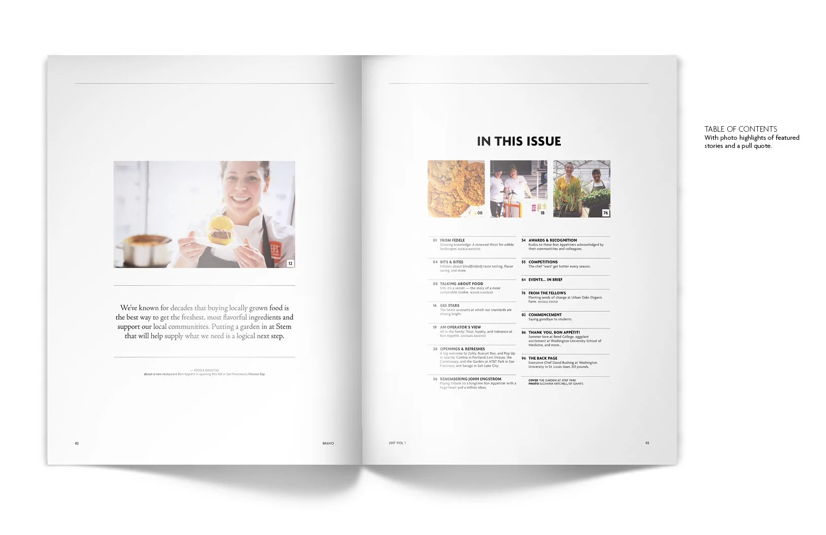
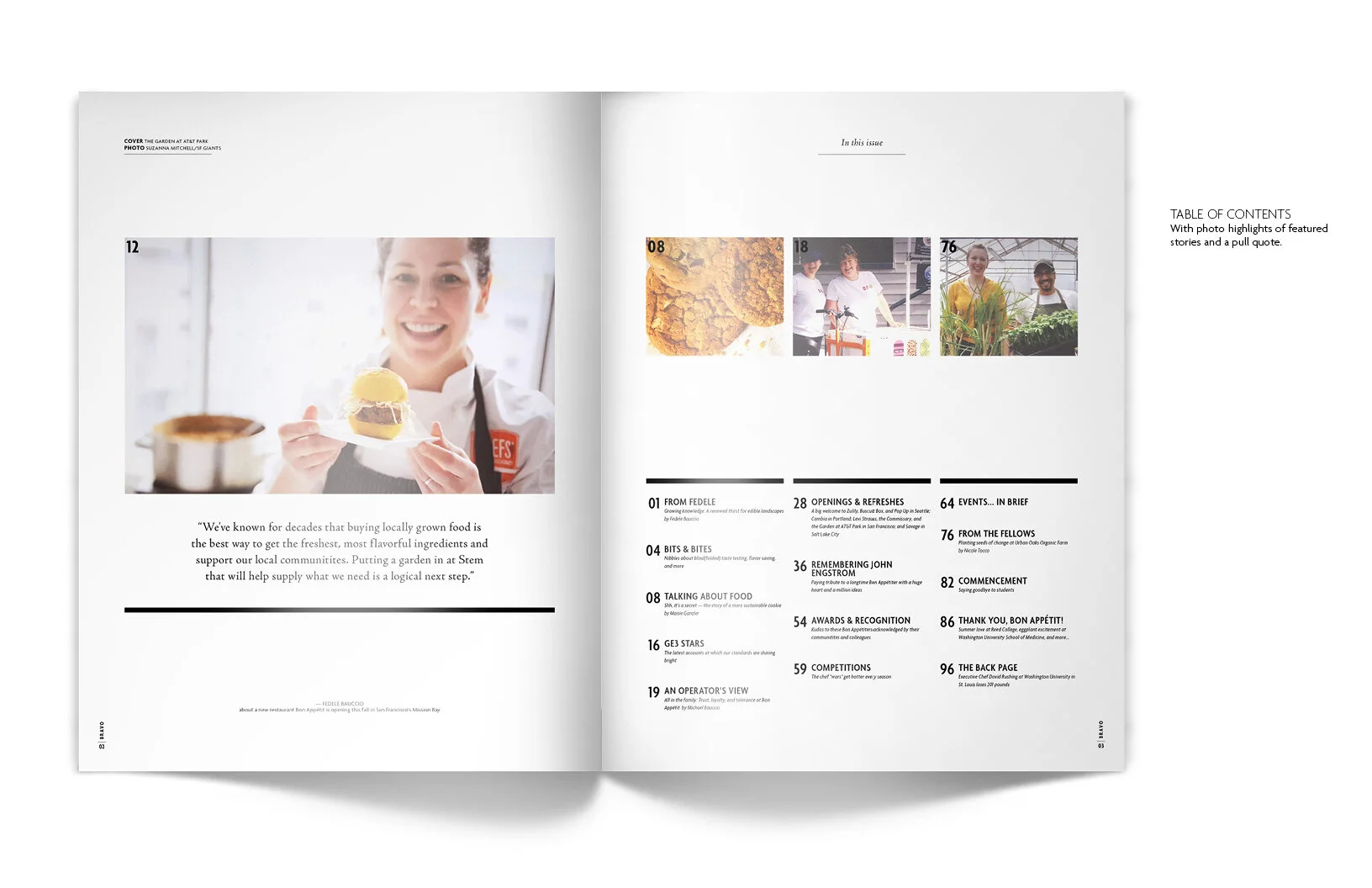
The magazine today is clean and simple but still has big impact. It’s built on a six-column grid that offers enough flexibility to easily fit a wide variety of article lengths and groupings.


